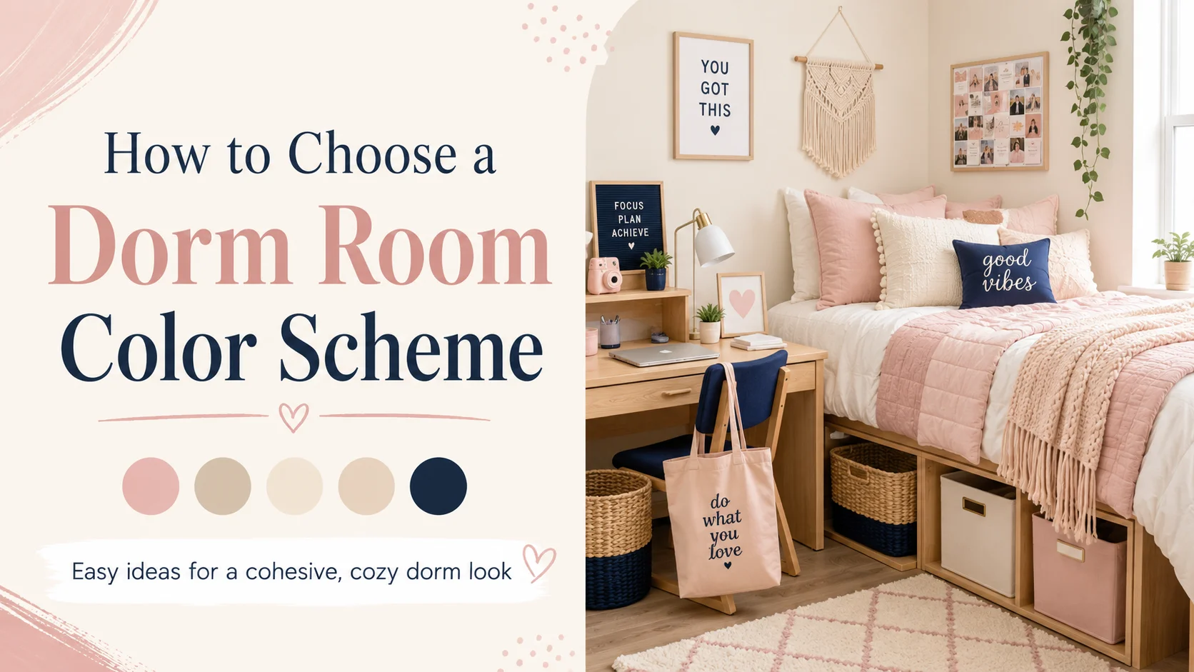
Choosing a dorm room color scheme is one of the easiest ways to make a basic college room feel more organized, comfortable, and personal.
The right palette connects your bedding, storage, wall decor, rug, desk accessories, and smaller details so the room looks intentional rather than randomly assembled.
This guide explains how to choose a practical dorm color palette, coordinate it with a roommate, shop in the right order, and avoid common mistakes in a small shared space.
Affiliate disclosure: This article contains affiliate links. HowItSee may earn a small commission from qualifying purchases at no additional cost to you.
You do not need expensive decor to create a coordinated dorm. A simple palette repeated across the largest and most visible pieces can make affordable bedding, baskets, prints, and accessories feel much more polished.
The best approach is to choose the mood first, select the bedding, and then add one or two supporting colors. This helps prevent impulse purchases that look appealing individually but do not work well together.
Simple formula: Use two main colors for large items and one accent color for smaller details. Repeating those colors in several areas makes the room feel connected without looking overly matched.
Quick Navigation
Why Your Dorm Room Color Scheme Matters
A color scheme is not only decorative. It gives you a filter for every purchase. When the bedding, storage, rug, wall art, and desk area share a small set of colors, the room feels calmer and easier to organize.
Without a plan, it is easy to collect pieces that look attractive separately but become distracting in a compact room. Several strong colors and competing patterns can make a small space feel even more crowded

Useful rule: Repeat the same two or three colors in different parts of the room rather than introducing a new color with every purchase.
| Color Family | Typical Effect | Works Well For |
|---|---|---|
| Light neutrals | Can make the room feel calmer, brighter, and less visually crowded. | Small dorms, minimalist rooms, and shared spaces. |
| Pastels | Introduce gentle color without dominating the room. | Soft, cheerful, and cozy dorm setups. |
| Earth tones | Create warmth and pair easily with natural textures. | Boho, relaxed, and warm neutral rooms. |
| High-contrast colors | Add energy and a stronger visual identity. | Modern, bold, preppy, or creative dorm rooms. |
1. Choose The Bedding Before Smaller Decor
The bed usually occupies the most visual space in a dorm, so the comforter or duvet should establish the direction of the palette. It is much easier to choose pillows and prints around the bedding than to find bedding that matches several unrelated accessories.
Neutral bedding gives you flexibility because the accent color can be changed later. Patterned or colorful bedding can also work, but the rest of the room should remain simpler so the design does not feel overcrowded.
Easy Bedding Formula
- One solid or lightly patterned comforter
- One accent throw blanket
- Two coordinated pillow covers
- One optional decorative pillow
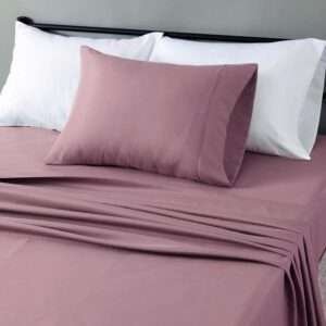
Budget Product Idea: Twin XL Bedding Set
A coordinated Twin XL set can reduce the number of separate pieces you need to purchase. Look for washable materials and included pillow shams that already fit the planned palette.
For a broader packing guide, see our list of dorm room essentials every college freshman needs.
2. Use Two Main Colors And One Accent Color
A three-color structure is simple enough for a small room but still gives you variety. The two main colors should appear on the larger or repeated items, while the accent color should be reserved for smaller details.
For example, white and beige can form the base through bedding, storage, and a rug. Sage green can then appear on pillows, art, a throw, or one desk accessory.
| Color Role | Where To Use It | Example |
|---|---|---|
| Main Color 1 | Bedding, curtains, or a larger rug | Warm white |
| Main Color 2 | Storage, furniture details, or blanket | Beige |
| Accent Color | Pillows, prints, desk accessories, or a small lamp | Sage green |
3. Decide How You Want The Room To Feel
Color is easier to choose when you begin with a mood instead of a trend. Think about whether you want the dorm to feel calm, cozy, cheerful, modern, natural, or bold.
- Calm: warm white, pale blue, sage green, light grey, and beige
- Cozy: cream, taupe, chocolate brown, terracotta, and muted gold
- Soft and cheerful: blush, lavender, butter yellow, white, and light grey
- Modern: white, charcoal, black, walnut, chrome, or brushed metal
- Bold: coral, deep blue, bright green, yellow, or pink used with a neutral base
For more visual directions, see our guide to dorm room ideas for 2026.
10 Dorm Room Color Scheme Ideas
Use these palettes as starting points. You can copy one exactly or replace one color with a similar shade that better suits your style.
1White, Cream, And Beige
This is one of the easiest dorm palettes to use because it keeps a compact room feeling bright, calm, and visually open. It also gives you plenty of flexibility when choosing storage and accessories.
Use white or cream bedding as the base, beige baskets or bins for storage, a soft neutral rug, and warm lighting. Add texture through knit blankets, woven materials, and subtle patterns so the room does not feel flat.
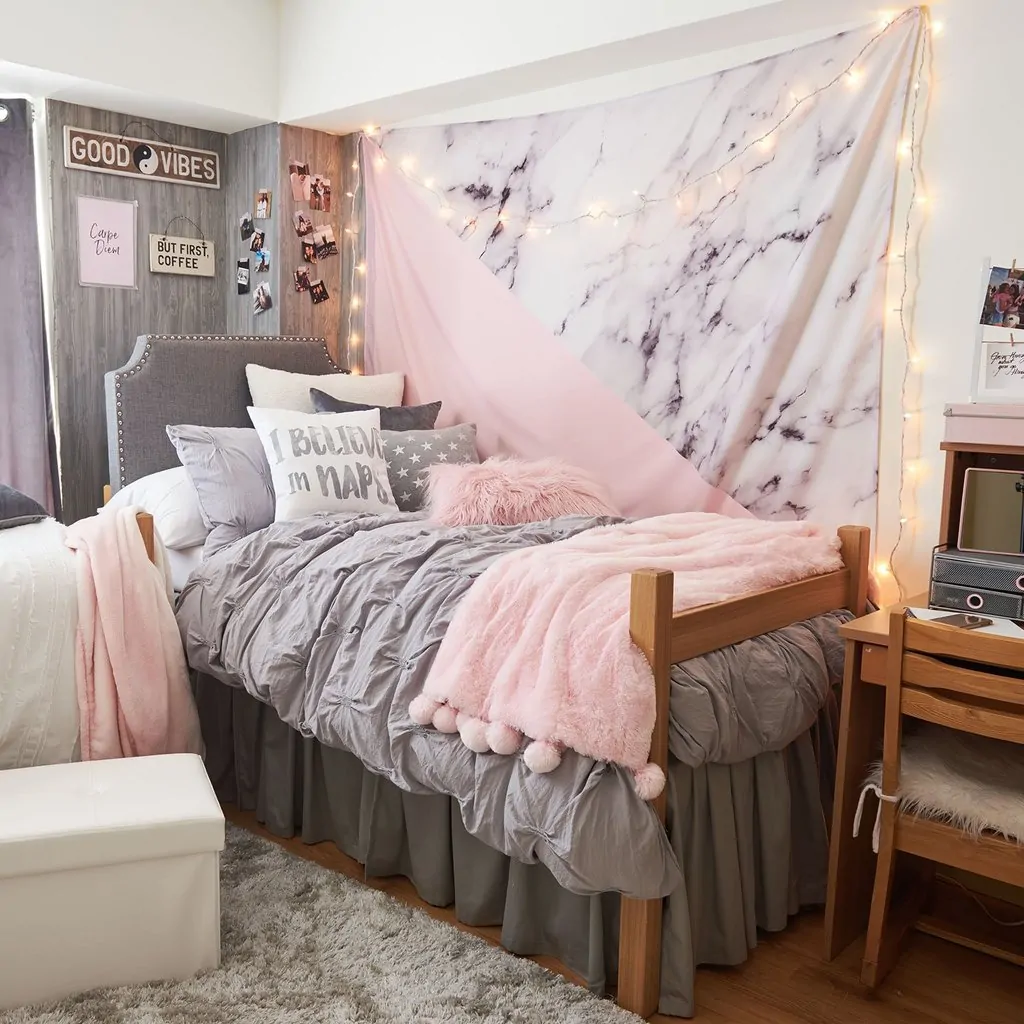
2Blush Pink, White, And Light Grey
Blush pink brings softness, while white keeps the room fresh and light grey prevents the palette from feeling overly sweet. Together, the colors create a gentle and balanced look.
Try white bedding, a blush throw, grey pillows, and a small number of pink or neutral wall prints. Warm lighting works especially well with this combination.
3Sage Green, Cream, And Natural Wood
Sage green works well in dorm rooms because it introduces color without feeling loud. Cream and natural wood tones keep the palette warm and relaxed.
Use cream bedding, sage pillows or art, light wood accessories, and woven storage. A small amount of greenery can strengthen the natural look without making the room feel themed.
4Black, White, And Gold
Black, white, and gold can make a dorm feel modern and polished when white remains the dominant color. Black adds contrast, while gold introduces warmth and a more finished look.
Use white bedding, black frames or organizers, and only a few gold accents such as a lamp, tray, or mirror detail. Too much black can make a tiny room feel visually heavy.
5Blue, White, And Tan
Blue, white, and tan creates a clean, relaxed palette that works for many styles. Light blue feels airy and calm, while navy creates a more classic appearance.
Pair white or tan bedding with blue pillows, simple wall art, and a neutral rug. This palette is also easy to coordinate in a shared room.
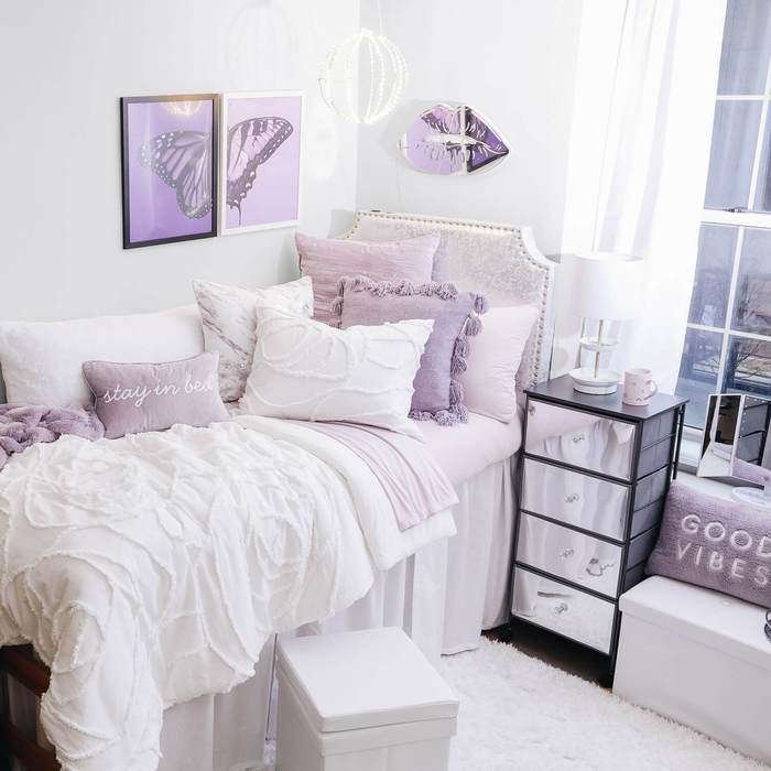
6Lavender, White, And Silver
Lavender adds color while still feeling soft and peaceful. White prevents the room from becoming too dark, and silver or clear accessories add a clean finish.
Use white bedding, lavender pillows or a throw, and silver details through a lamp, mirror, or desk accessories. Keep metallic accents limited so the room remains comfortable rather than overly shiny.
7Terracotta, Cream, And Brown
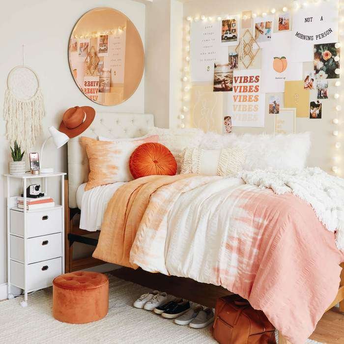
Terracotta, cream, and brown creates a warm, grounded dorm room. It works particularly well with woven textures, wood tones, and natural-looking storage.
Start with cream bedding, then add terracotta cushions, a brown throw, and baskets in tan or natural fibers. The result feels mature and cozy without using too many colors.
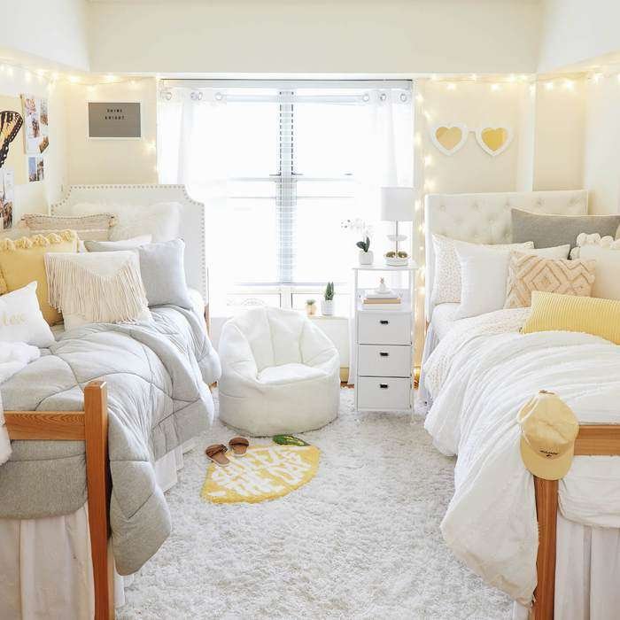
8Butter Yellow, White, And Light Wood
Butter yellow is cheerful without being too intense. Combined with white and light wood, it can make a small dorm feel sunny and welcoming.
Keep yellow as the accent through pillows, a throw, prints, or one desk accessory. Let white bedding and light wood storage carry most of the room.
9Grey, White, And One Pop Of Color
Grey and white provide a flexible background for almost any accent color. This is a practical option when you are unsure which color you will want throughout the entire year.
Use grey bedding or storage, a white desk setup, and one accent through art, pillows, or a blanket. The accent can later be changed without replacing the main pieces.
10All Neutrals With Layered Texture
An all-neutral dorm can feel rich and comfortable when the room includes varied textures. Without texture, using one similar color everywhere may look unfinished.
Combine a cream comforter, waffle-knit or chunky throw, woven basket, low-pile rug, linen-look curtain, and small wood or metal details.
Dorm Color Scheme Cheat Sheet
| Dorm Style | Palette | Useful Decor Pieces |
|---|---|---|
| Bright Neutral | White, cream, beige, light wood | Neutral bedding, woven baskets, warm lamp |
| Soft Feminine | Blush, white, light grey | Blush throw, white bedding, simple prints |
| Earthy | Sage, terracotta, cream, brown | Plants, woven bins, textured blanket |
| Modern | Black, white, grey, walnut | Black frames, white bedding, slim lamp |
| Coastal | Blue, white, tan | Blue pillows, tan rug, white comforter |
How To Coordinate Colors With A Roommate
Roommates do not need identical bedding or matching decor. One shared neutral or repeated color is usually enough to make the room feel connected.
For example, both sides can use cream or white bedding while one person adds sage and the other uses blue. You could also coordinate only the rug, lamps, curtains, or visible storage.
Roommate-Friendly Options
- Use the same neutral base with different accent colors
- Choose similar lamps or matching bulb temperatures
- Coordinate visible storage bins
- Agree on one shared rug or curtain color
- Avoid buying duplicate appliances or oversized shared decor
When curtains are part of the shared plan, review our guide on hanging dorm room curtains without damage.
What To Buy After Choosing The Color Scheme
Shop from the largest visual pieces to the smallest. This makes it easier to maintain the palette and reduces the chance of buying accessories that do not work with the final bedding or rug.
| Buy First | Why It Matters | Shopping Link |
|---|---|---|
| Bedding | It occupies the most visual space and establishes the main color. | Twin XL bedding sets |
| Throw blanket | Introduces the accent color and adds texture. | Dorm throw blankets |
| Pillows | Repeat the accent color without requiring a large commitment. | Dorm throw pillows |
| Storage bins | Visible storage affects the palette and helps control clutter. | Dorm storage bins |
| Wall art | Completes the palette after the main pieces are established. | Dorm wall art prints |
Use matching containers only where they genuinely solve a storage problem. Our guide to smart dorm room storage hacks can help you choose organizers that fit the space.
Dorm Color Scheme Mistakes To Avoid
- Using too many main colors: Keep the palette limited so a small room does not feel chaotic.
- Buying decor before the bedding: The largest visual piece should guide the smaller purchases.
- Ignoring visible storage: Bins, carts, and organizers contribute to the overall appearance.
- Making every item match exactly: A coordinated room still needs varied textures and a little contrast.
- Using only dark colors in a tiny room: Balance darker accents with lighter surfaces to avoid a heavy feeling.
- Forgetting your roommate: Shared pieces should be discussed before either person begins shopping.
A Reliable Palette For A Very Small Dorm
When the room is especially tight, a light neutral base with one softer accent color is an easy place to begin. Warm white, cream, beige, pale grey, and light wood keep the largest surfaces visually quiet.
Small dorm formula: Cream or white bedding + beige or light grey storage + one soft accent color + warm lighting.
A light palette does not have to feel boring. Texture, prints, photographs, plants, and small desk details can add personality without overwhelming the room.
More Dorm Room Guides
FAQs About Dorm Room Color Schemes
What is an easy color scheme for a dorm room?
A light neutral base with one accent color is usually easy to manage. Cream, white, beige, light grey, sage, muted blue, and blush are flexible choices for a small room.
How many colors should be used in a dorm?
Two main colors and one accent color provide enough variety without making the room look disorganized. Additional colors can appear in small personal items, but they should not compete with the main palette.
Do roommates need matching dorm decor?
No. Using one shared neutral, rug color, lamp style, curtain color, or storage finish can make the room feel connected while allowing each person to choose a different accent color.
Which colors can make a dorm feel larger?
Light colors such as warm white, cream, beige, pale grey, and soft blue reflect more light and reduce visual heaviness. Darker shades can still be used in smaller accents.
How can a budget dorm palette look more expensive?
Repeat the same colors across several areas, use matching visible storage, choose warm lighting, and mix textures such as knit fabric, woven baskets, smooth frames, and soft rugs.
Final Thoughts
Choosing a dorm room color scheme becomes much easier when you work from the largest pieces to the smallest. Select the bedding, choose two main colors, add one accent, and repeat those shades across storage, textiles, and wall decor.
A neutral foundation is the most flexible option, but it is not the only one. Pastels, earth tones, coastal colors, and modern contrasts can all work when the palette remains consistent.
The goal is not to make every item match perfectly. It is to create a room that feels comfortable, organized, and personal while using color in a deliberate way.

Meet Monty, the visionary founder of How It See, being an engineering student, he’s fueled by an insatiable curiosity about the world around him. He is captivated by an eclectic correlation between animal groups, science, and nature, and this fascination drives his quest for understanding.
After completing his degree, he’s set on a mission to delve deep into the realm of nature, accumulating knowledge to share with you through his writing. In the meantime, he loves to watch anime and read anime.